Abstract Expressionism at the RA

Abstract Expressionism emerged in the 1940s in the United States and remained a predominantly American phenomenon. Its main characteristic, according to the Oxford Dictionary of Art, is the “desire to convey powerful emotions through the sensuous qualities of paint, often on canvases of huge size.” The Baroque movement of the 20th century, then? A Counter-Reformation against intellectual, social- and community-minded –isms, with all their rules and strictures, and a headlong, self-conscious race into the arms of feeling.

Abstract Expressionism, on show at the Royal Academy, London, until 2nd January 2017.

The genesis of the movement is well illustrated in the first room. Two early figurative works by Mark Rothko are hung on the right. Both date from 1936. One is his Self-portrait: the fat, red twisted lips and dark blind circles of eyes hidden by dark glasses strike a disreputable and sinister note. The other work is Interior, where a pair of ghostly white and faintly grotesque classicist sculptures flank a dark doorway populated by a huddle of brown-clad, white-faced, stricken-looking people. Normality and the conventional are shown distorted and turning ghoulish.

There is a scene in the film Funny Face where the character played by Audrey Hepburn, feeling angry and put upon by the character played by Fred Astaire, says: “Isn’t it time you realised that dancing is nothing more than a form of expression or release? There’s no need to be formal or cute about it. As a matter of fact, I rather feel like expressing myself now. And I could certainly use a release.” And then she dances. Wonderfully well. It is the only really good scene in the film.

Abstract Expressionism is like that. An emotional response to an external trigger. Dark times (world war, economic depression) cannot be argued away by reason, logic or objectivity. Objects turn ugly. What we can use is colour and gesture.

The exhibition rooms are crowded with visitors. The air hums with their whispered reactions. There is talk of “creative revelation” and of “traumatic experience”. These are personal responses. The artworks themselves are personal responses. Here we are as an audience, being called on to respond personally to a series of personal responses. This is art as me-journalism. And when the artist’s response succeeds in triggering a response of our own, either in reaction or in sympathy, the result is extraordinarily powerful. This is the ideal time to be looking again at these works, in an age so politically polarised that we can scarcely even sit at the same table as people who don’t agree with us. We need Abstract Expressionism to save us from fetishes and propaganda.

But is self-expression anything more than simple self-indulgence? Yes, if the self-expresser is equipped with the vocabulary to interpret his or her feelings productively. All (or almost all) of the artists represented in this show are very well equipped, and their eloquence elicits a productive response. The solemn, Beaux Arts neoclassicism of the exhibition rooms is a perfect foil for this art.

The problem, though, is that too many feelings are being expressed. And too few walls are available to harbour all the wealth of feeling that is outpoured. The result is a clamorous hubbub. And there are very few places to sit down. But perhaps this is a quibble. You need to give yourself time. This is not a show to see in a hurry.

The work of Arshile Gorky had a formative influence on the AbEx movement and an entire room is dedicated to him. He does not use the medium of abstraction to express emotions or ideas; he is rooted in Surrealism and his paintings send audiences scrabbling for figurative interpretations. The exhibition points out Gorky’s “knack for camouflaging forms so that their identities hover between the recognisable and the cryptic.” This means that we are perpetually trying to see forms in all his works, forms that will provide the meaning and the interpretation, like looking for recognisable shapes in clouds. We do this with The Orators, which the wall text tells us is an “artfully obscured scene of figures around the funeral bier of Gorky’s father.” The figures are either obscured too artfully or not obscured enough. We spend too long intellectualising, trying to make them take comprehensible shape. If we aren’t careful, we can talk a lot of rubbish about art like this. Fortunately AbEx didn’t linger there.

For a while perhaps it looked as if it was going to. Willem de Kooning, in his figurative phase, makes us sit and watch while he wrestles with the age-old male dilemma: Women. Do you worship them or make fun of them? Thankfully he emerges from it to give us his best work (and the finest two pieces in the room dedicated to him): Villa Borghese (1960) and Untitled (1961), generous patches of lemon yellow, blue, green and pastel pink, which evoke sunshine and tranquillity. Franz Kline’s violent black slashes across white backgrounds evoke cast-iron bridges, steelyards and gantries. They are like photography gone backwards into painting. One enjoys them in silence, they are all about atmosphere. So is Milton Resnick’s beautiful, wintry Octave, which strikes the viewer like a grey day at Giverny.

Monet is not the only artist echoed and challenged by these painters. Picasso also looms large. And Jackson Pollock’s Summertime 9A looks like a Mondrian pulled so tight that the black lines have stretched and buckled: released, they spring back into a knotted, rhythmic tangle, clotted with the yellow, red and blue areas of infill.

Age-old scriptural and mythological figures are abstractly explored by Barnett Newman: Adam, Eve, and Ulysses (1952). Tempting as it is in Ulysses to interpret the strongly divided planes of blue as representations of sea and sky, Newman has chosen to make his axis a vertical one. So we are left more with a mood and a feeling than an idea, and the result is restful. Vast landscapes are evoked by Clyfford Still. Ad Reinhardt puts a frame around black nothing to turn it into something, a thing to go on a wall, like a sort of anti-mirror, sucking all reflections in, giving nothing back.

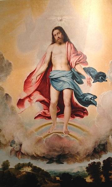
And what about Rothko, who famously hoped to “ruin the appetite of every son of a bitch” who dined in the room where his Seagram murals were to hang? If they had ever been hung there, I doubt he would have succeeded. His Self-portrait or Interior would have appalled the sons of bitches. De Kooning’s Woman II would have had them running for the door. Rothko’s colour-field rectangles such as No. 4 (Untitled) couldn’t possibly. Here is an artist who set out with such aggressive intent, aiming to “defeat” the walls with the plenitude of his art. Yet the result is tremendously relaxing and satisfying. It is daring but it is not terrible. The whole gamut of human emotion is there, but there is no dissonance. Each tableau speaks like a still small voice of calm. Expressionism, when it is figural, is grotesque. When it is abstract, it is not, however belligerent or morbid the emotions that engendered it. The Rothko paintings, in the central octagon, are as gorgeous and uplifting as any juxtaposition of tragedy and ecstasy in a Baroque canvas of sacred apotheosis. Where they triumph (and where other Abstract Expressionist artists fail) is that they leave you with nothing to say. You can only feel.

The scale of these works, in terms of the value of their content, is in almost every case equal to their size. The “sensuous qualities of paint” are also important. What strikes one forcibly is how old-fashioned the works are. There is no dilettantish daubing at play here. We are dealing with a masterly handling of the medium. What people are responding to is not just the call on their emotions but also the sheer skill of the artists. No one would ever look at one of these works and say, “I could paint that.”

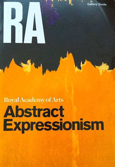
Abstract Expressionism at the Royal Academy, London, until 2nd January.

Five major London museums

Emily Barber, author of Blue Guide London, recommends five main museums: 

1. “V&A” – the Victoria and Albert Museum – for its architecture and varied content. It is also home to the National Art Library which is a peaceful place to read or study overlooking the courtyard. And the V&A houses one of best collections of jewellery in world.

2. National Gallery – as the best place just to wander and see some of the finest paintings in the world.

3. National Portrait Gallery – where the galleries aren’t too large so feel personal. The brilliant portraits are stunning as art and fascinating as history.

4. The Tower of London – where the Norman White Tower still retains a sense of its impressive ancient past. The pure austerity of the Chapel architecture gives a peaceful sanctity (if there aren’t too many tourists). The gems in the Crown Jewels are legendary. Have a chat with the famous ravens who are excellent mimics.

5. Hampton Court – a perfect palace in gorgeous setting by river. It still conveys a sense of wonder as you approach and see twisted Tudor chimney stacks. The Stuart part of the palace has one of the finest 17th century interiors in the UK.

Whither Tate Britain?

London is thriving, museum attendance is higher than ever.  Here are the numbers (visitors) for some of the main museums:

20142004
1British Museum6,695,2134,868,176+38%
2The National Gallery6,416,7244,959,946+29%
3Tate Modern5,785,4274,441,225+30%
4V&A South Kensington3,180,4502,010,825+58%
5Somerset House2,463,201n/a
6National Portrait Gal.2,062,5021,516,402+36%
7National Maritime Mus.1,516,2581,507,950+1%
8Tate Britain1,357,8781,733,120*-22%
9Imperial War Museum914,774754,597+21%
10Hampton Court Palace560,513498,278+12%
11Churchill War Rooms472,746306,059+54%

Source ALVA (* Tate number is for 2005, 2004 not given.)

William Hogarth 1697-1764

So what’s going on with poor old Tate Britain?  Its stunning collection of many of the best-known works from the greatest names in British painting—Hogarth, Turner, Blake, Constable—seems underplayed on the website, and yet this should put Tate Britain at the top of the list for the London visit of every British school child, foreign tourist, NADFAS day tripper or urban intellectual. And indeed shows on subjects such as the Pre-Raphaelites or Turner do well. The exhibitions with challenging themes maybe less so: irrespective of their quality, this may not be where Tate Britain’s competitive advantage lies?

And what about the legacy of its modern art mission, thoroughly eclipsed by the arrival of its altogether more modern—right down to the name—sibling, Tate Modern, in 2000?

All questions for the people who run ‘Tate’.  And very relevant now, as a replacement is sought for Tate Britain’s chief Penelope Curtis.  Hard decisions and major changes may be needed, but, asks Martin Oldham in Apollo Magazine, is her successor being handed a poisoned chalice (Tate Britain: A Poisoned Chalice)?

The new Blue Guide London covers all the museums in the table above, and many more, extensively. And all are listed in the older Blue Guides Museums and Galleries of London.

Artwork of the Month: January. Medieval stained glass

Medieval stained glass is relatively rare in English country churches because so much was destroyed by zealots during the Reformation in the 16th century and under Cromwell in the 17th. Fragments of old glass exist and have been pieced together in many windows across the country, but entire windows are scarcer. The two shown here are from c. 1350. They are the north and south chancel windows of the church of St Andrew in Chinnor, Oxfordshire, just at the foot of the Chiltern Hills. Light was poor in the church when I was there and these are the best images I could get: photographs taken with my telephone. The window on the left (the north window) shows two bishops, with crosier and processional cross. Above them, in the quatrefoil, is a depiction of one of the Seven Acts of Mercy: Feeding the Hungry. The window on the right (the south window) shows St Lawrence and St Alban and another of the Seven Acts, Clothing the Naked: a man in yellow (St Martin) is seen giving a green garment to a naked man. (The other Acts of Mercy are Giving Drink to the Thirsty, Sheltering the Homeless, Nursing the Sick, Visiting those in Prison and Burying the Dead. Caravaggio manages to depict all seven of them in a single canvas in a famous painting in Naples. Perhaps at one time all seven were shown in the windows of this little church, too.

Giovanni Battista Moroni

At the Royal Academy, London until 25th January.

For anyone who loves Lombardy, Giovanni Battista Moroni (1520/4–1579/80) will be a familiar name. He is one of the finest portraitists of 16th-century Italy. This small and beautifully curated show at the Royal Academy attempts to demonstrate that he can stand with the finest portraitists of any time or place.

Moretto da Brescia: Count Martinengo (c. 1545–50)

Moroni’s reputation outside his native Lombardy suffered from the fact that he never left it, except for visits to Trento at the time of the famous ecumenical council. The city of Bergamo, in whose district he was born, was a part of the Republic of Venice. But Moroni never went there, as others did, to become a star in its serene firmament. He stayed at home and painted portraits of local nobles and tradesmen, altarpieces for local churches, and panels for the personal devotion of local patrons. He was famous and much appreciated in his lifetime, but faded from view thereafter—at least, outside his homeland. The blame for this is traditionally laid at the door Vasari, whose Lives of the Artists does not mention him. And yet Moroni was only producing his best work around the time that the expanded edition of the Lives was published, in 1568. And when Vasari travelled to northern Italy in search of material in 1566, he did not visit Bergamo, or Albino, the little town to its northeast where Moroni was born and to which he returned to work in his later years.

Vasari does however mention Moroni’s master, Moretto da Brescia. He was “a delicate colourist and of great diligence,” we are told, “fond of imitating cloths of gold and silver, velvet, damask and other kinds.” The exhibition opens with a selection of his works: some portraits and an altarpiece. His portrait of the haughty young Count Martinengo (from the Museo Lechi in Montechari) shows the technique that his pupil Moroni would adopt with such success: a three-quarters tilt to the head, eyes fixing the viewer, the sitter’s face the focus of the artist’s efforts, background elements at a minimum (though you will start to recognise some studio props: the gloves, the chair, the leather-bound book). The best portraits are not showpieces of wealth and consequence. They are likenesses—psychological studies—of ordinary human beings. That, to our modern eye at least, is what is most absorbing.

And indeed, they keep the viewer riveted. The show was crowded when I went, and visitors were stuck fast in front of the portraits, audioguides clamped to their heads, whispering to each other in rapt admiration. The altarpieces commanded far less attention. This is not necessarily fair, because if Moroni’s sacred subjects fail, they fail for a reason. The Council of Trent, which abjured the Protestant Reformation, called for a return to the precepts of the past, an establishment of rules and method, a forsaking of invention and novel interpretation. Later it was to shake itself free and find its own Counter-Reformation style, the sensual, ecstatic, exuberant Baroque, charged with a direct emotional appeal. But this had not happened yet. Painters of religious subjects in Moroni’s day were rigidly stuck with old themes and old poses, not wanting to be archaic but unsure how to be modern. This predicament is brilliantly illustrated by two large-scale altarpieces of the Trinity, the first by Lorenzo Lotto (1519/21; Museo Bernareggi, Bergamo) and the other by Moroni (c. 1552; church of S. Giuliano, Albino). Both show pale clouds parting to reveal the primrose-yellow dazzle of Heaven. Christ appears in the centre, upon a rainbow, with the dove of the Holy Spirit above his head. Behind him, in looming shadow, is God the Father. But in Lotto’s version God appears in shadow only, as a suggestion of immanent power, hands upraised. In Moroni’s Trinity, God has been humanized. He has a face, a blue robe. His arms encircle Christ in a gesture of protection. But the overall effect is stilted, bizarre. The rolled up sleeves make him look like a strongman about to perform a feat of heavy lifting. “Is that supposed to be God?” someone asked incredulously, “You don’t normally see pictures of God, do you?” “Of course you do,” his wife testily reproved him, “Michelangelo did one.” Yes, Michelangelo did, in sophisticated, neo-pagan Rome on the Sistine ceiling. A God looking like an ancient Zeus touching fingers with Adam in the guise of a body-perfect ephebe. But that was Rome and that was then. This is Lombardy. One cannot do portraits of God.

Lorenzo Lotto: Trinity
Giovanni Battista Moroni: Trinity

Portraits of men and women, on the other hand, are another matter. Nowhere is this dichotomy better revealed than in Moroni’s sensational Last Supper (1566–9), painted for the Confraternity of the Holy Sacrament in Romano di Lombardia, where the faces of Christ and his disciples are stock character heads, in sharp contrast to the man standing at the back. An intruder into the scene, he plays the role of host or servitor at the supper party, holding a flagon of wine in his hand and looking us straight in the eye. This is a portrait of a real person; perhaps, it is thought, the parish priest of the little town. The dimension he inhabits is perceptibly different from that of the staged actors in the famous dinner drama, who are all playing prescribed parts and have no existence beyond them.

Moroni, like his master before him, was fond of painting fabrics. What Vasari does not tell us is that Moretto painted the first ever Italian full-length portrait, in 1526 (London’s National Gallery has it). His pupil borrowed both the full-length and the three-quarter-length style and took them to new heights. There are some superb portraits in this exhibition, shown to dazzling effect in the third room, where nine works have carefully been chosen to complement each other to perfection. Two seated ladies (opposite each other), three full-length men (opposite each other and opposite the door) and four three-quarter-length men are hung with careful attention paid to which direction their gazes face. Yet the hang is both complementary and antagonistic. The two women, both poetesses, were from opposing factions in the Bergamo of the day, the bloodily feuding Albani and Brembati families. The Brembati belonged to the imperial, pro-Spanish faction: the striking Man in Pink, Gian Gerolamo Grumelli (from Palazzo Moroni in Bergamo, the home of the artist’s descendants), was the husband of Isotta Brembati (the second of the poetesses). It is signed and dated “Jo. Bap. Moronus p. MDLX” and features a Spanish motto: “Mas el çaguero que el primero” (Better to hang back than to rush to the front; an admonition to prudence?). Behind the sitter is a ruined wall. Damaged masonry over which ivy creeps and into which weeds intrude—and beyond which blue sky and cirrus clouds can be seen—is a favourite Moroni backdrop. It occurs in five of the nine portraits in this room and again in the final room. The architectural background with blue sky behind was used by Moretto in his first full-length. Again, Moroni adopts, adapts and carries forward: the warning of ruin and decay, it seems, was his idea.

Moretto: Portrait of a Man (1526)
Moroni: Man in Pink (1560)

In the final room we come face to face with Moroni’s famous Tailor (c. 1570; National Gallery, London), and other mature works which show, in the curators’ judgement, his role as a foreshadower of Manet and Ingres. The Tailor shows a finely-dressed young man in fashionable slashed pantaloons, looking up from his worktable where he was about to cut a length of black cloth. Black, the exhibition catalogue notes, became the favoured colour for men’s costumes, replacing the sumptuously coloured stuffs of earlier years. The tailor himself is obviously a successful artisan. Tailors, according to the wall caption, often dressed well—perhaps as a way of making themselves walking advertisements for their trade. But it was not the tailor’s eyes that stayed with me, as I walked out onto a rain-washed Piccadilly. It was those of the Lady in Black, whose portrait (c. 1570; Palazzo Moroni, Bergamo) is a model of minimalism and a seeming effortless skill at capturing not just a likeness but a personality.

Go and see this show if you can. The ticket price is not cheap (£12) but I think you will feel it was worth it.

Moroni: Lady in Black

Reviewed by Annabel Barber. The Royal Academy, its history, role and exhibitions, as well as the architecture of its home, Burlington House, are all described in detail in Blue Guide London.