Rendez-vous with Art

Philippe de Montebello in conversation with Martin Gayford, Rendez-vous with Art, Thames and Hudson, 2014.

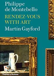
Philippe de Montebello, French by birth but a New Yorker by upbringing, remains the longest serving director of the Metropolitan Museum, with 31 years to his credit when he retired in 2008. He is still very active and he arranged to meet with the English art critic Martin Gayford, where and when they could, to see and discuss some of the works that most fascinated them. This is the finely-illustrated record of their discussions.

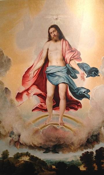
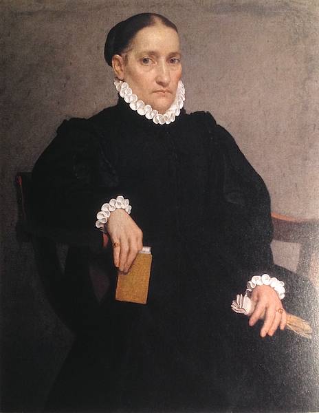
I really enjoyed this book. Some of the works selected I knew; others I did not or had certainly never seen ‘in the flesh’. One of the very first, a sculpture that inspired Montebello when he first saw it aged 15, is the meditative face of Marchioness Uta from high up on the choir of Naumburg Cathedral. It is now, remarks de Montebello (with some regret that his secret love is out), posted everywhere on the internet, although it had passed me by and I was pleased to know of it. And then there is Donatello’s Mary Magdalene, the penitent’s nakedness covered in her flowing hair, that I have seen only once in Florence. The morning after the disastrous Florence flood of November 1966, de Montebello found himself alongside Harold Acton gazing at the mud-caked statue. Acton, having donned his hunting boots for the chauffeur-driven excursion down from I Tatti, was in tears.

De Montebello is unashamedly patrician. Visiting the magnificent Wallace collection in London he imagines himself at the opulent writing desk of 1770 created by Jean-Henri Riesener and ‘transported back into an era of unabashed luxury’. There is perhaps a tension here with Gayford, who notes that it is this ‘kind of dizzyingly luxurious living that helped to bring about the French Revolution’. It is doing no disservice to Gayford not to quote him here so often as de Montebello, as he plays his part well in drawing de Montebello out and then reflecting on what inspires this art historian in his choices: ‘a quality of silence and restraint, combined with compelling naturalism’ in one instance. Again, in the world of Art History where jargon and sociological theory so often threaten to come between the viewer and a painting, how refreshing it is to hear de Montebello comment on how ‘occasionally, it can be restful to contemplate comfortably, uncomplicatedly, something that makes you smile inwardly’.

For some readers, these leisurely strolls around galleries may all be too gentle and elitist. (‘A characteristic of great works of art is that they persistently catch our attention and beckon us’ catches the mood of time to spend.) And there is no more than the odd reference to anything modern. But once you have accepted this, you will find many good reflections, especially on the placing of art. What is the best context to show a painting and what is lost, for instance, by taking an altar from the church for which it was designed and placing it in a museum? How far does one’s appreciation of art depend on where a work is displayed in contrast to others around it? Is it possible ever to appreciate the Mona Lisa and other trophy works now that tourists hem them in, ticking them off their must-see (or must- photograph) lists? (Although I couldn’t help feeling that de Montebello would have been able to fix any secluded visit he wanted without difficulty!)

One of the most rewarding parts of the book describes how de Montebello came to purchase a superb Duccio Madonna and Child for the Met. Of course, it helps to have $45 million available for a single purchase, but the Louvre was after it as well. It is indeed a delightful work, a devotional image from the cusp of the transition from Byzantine to Renaissance and there is a wonderful tenderness in the way the Christ child reaches up to his mother’s cheek. De Montebello weighed it up, literally in his hands for an hour, as he worked through all the competing issues of quality, provenance and importance within the unfolding of new directions in western Art. Finally there is the ‘irrepressible need to win: to have won possession of the object of desire’ which brings everything to a climactic decision and the eventual purchase.

If I had to end my days in a large single room with 20 paintings by a single artist, I might well choose Chardin. De Montebello notes how a lovely example of Chardin’s work, La Tabagie of 1737 (‘about as satisfying and scrumptious a paint surface as exists’) in the Louvre, goes almost unvisited as it is on an upper floor away from the must-see superstars. By contrast, a visit to the Mauritshuis in The Hague is ruined for de Montebello by the massive posters of Vermeer’s Girl with a Pearl Earring which put him off revisiting the original because they killed ‘the freshness of the experience, the element of surprise, of discovery…’.

5th-century BC amphora attributed to the Berlin Painter. Metropolitan Museum, New York.

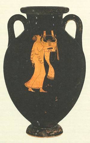
De Montebello is old-school in stressing the disciplined application required to appreciate art, and hence the need to avoid making museums places of transient entertainment. He notes how he had to be taken by his curator to view fragments of Greek vases to appreciate the quality of the painting, even more evident when seen on a complete vase. It was, in fact, one fragment of a single illustration, of a red-figure Greek vase from 490 BC, that beckoned to me. A scarf-like patterned fabric falls in a twist from a lyre… It drew me back more than once while I was absorbed in this civilized discourse on great art.

Reviewed by Charles Freeman, history consultant to the Blue Guides.

See this book on amazon.co.uk. See it on amazon.com.

Pedant’s corner: The Horses of St Mark’s are referred to in the book, as is usual, as being of bronze. In fact they are largely copper, a fiendishly difficult metal to cast. It has now been discovered that the gilding used to embellish them becomes blemished when applied to bronze but not to copper. Those 2nd-century ad craftsmen knew what they were up to. The horses are covered in detail in Blue Guide Venice. To make their acquaintance in greater detail still, see Charles Freeman’s The Horses of St Mark’s.

Rembrandt and the Dutch Golden Age

Szépművészeti Múzeum, Budapest. Until 15th February 2015.

This ambitious and extraordinarily ample exhibition will be the last of the Szépművészeti’s blockbuster shows, as the gallery is due to close in spring 2015 for large-scale refurbishment and reorganisation. The exhibition proudly presents works from the Szépművészeti’s own exceptionally rich 17th-century Dutch collection alongside loan works from the Rijksmuseum, the Metropolitan in New York, the National Gallery in London, the Nationalmuseum in Stockholm, the Louvre, the Uffizi, the Getty and the Prado—to name only a few. “Over 170 works by some 100 painters”, we are told, and of those some 20 are Rembrandts and there are three Vermeers. A colossal show indeed.

How will order and sense be brought to this vastness? The scope of the exhibition is briefly set out at the beginning. Seventeenth-century Holland was a young country responding to great religious and social change as well as to inspiring, life-improving and sometimes disquieting scientific advances. Much of its art was commissioned by men who had made money from commerce. Thus new genres resulted: we can expect to see cityscapes, landscapes, scenes of civic and family life. Rembrandt is included as a sort of breakout display, alongside works by his master and pupils, for the sake of comparison.

The rise of Holland as a world power is dated to the time when the Dutch provinces, led by William of Orange, threw off Habsburg rule in the late 16th century. The very first work of art on show is a portrait of William (1579) hung alongside a naval battle scene showing an engagement between Dutch and Spanish galleys, then an allegory of peace followed by another of colonial power. With the scene thus summarily set, the themes of the succeeding rooms are as follows:

Faces of the Golden Age: The Building of a New Society
Wealth and Moderation?
The Influence of Protestantism on Religious Painting
Rembrandt and his Circle
Cities and Citizens
Landscapes

These themes are then illustrated, copiously. “Faces” shows us portraits of wealthy burghers, their wives and families. Members of a civic society are shown witnessing a dissection—though in fact they are all eagerly facing the viewer, just like any modern crowd jostling to be in the photograph. Members of another society are shown at a banquet. “Wealth and Moderation?” begins with still lifes (a lovely painting of tulips by Bosschaert) and domestic interiors (a superb Young Man Reading by Candlelight by Matthias Stom; 1620–32).

Matthias Stom: Young Man Reading by Candlelight.

Later manifestations of both these genres show a moralising message creeping in. An old crone short-sightedly squinting at a coin, for example, becomes Sight or Avarice? A young girl looking at herself in a mirror becomes an Allegory of Profane Love. Pre-eminent here is Jan Steen’s In Luxury Beware (1663). A chaotic household is brought before us, dominated by a drunk and debauched young couple. Food and debris are all over the floor with a symbolic deck of spilled playing cards, the baby has got hold of a pearl necklace instead of its rattle, an untended fire blazes offstage right while the dog eats the remainder of dinner in the background on the left. The still lifes, too, become more sinister. Not merely celebrations of nature or of painterly virtuosity, they turn into allegories of the transience of life, of ephemeral luxury. Painting after painting (including Steen’s) includes the stock image of the half-peeled lemon, a symbol not only of passing time but a warning of bitterness below the surface. Snails invade the bouquets of flowers by Rachel Ruysch and Jan Davidsz de Heem.

“Religion” contrasts the paintings of the Utrecht school (the only city in Holland which retained a majority Catholic population) with stark depictions of image-free Protestant church interiors. The 20 Rembrandts are hung alongside his master Lastman and his pupils Flinck, Bol, Arent de Gelder, Hoogstraten (his wonderful, hyperrealist Letterboard one of the works on display) and Dou (master of the genre scene; his The Quacksalver of 1652 is a supreme example). “Cities and Citizens” gives us cityscapes (De Witte’s important c. 1680 interior of the Amsterdam synagogue) and urban domestic interiors, including Vermeer’s Astronomer and Geographer and some representative works by De Hooch, one of them expertly rendering the sunlight as it falls on a courtyard wall and another delicately capturing the effect of sunlight falling on the further wall of a room, reflected through the panes of a window opposite.

The last room, “Landscapes”, has some splendid works by Hobbema, Avercamp, Cuyp, Ruisdael, Wouwerman and Berchem. “But this is a terribly big exhibition!” one lady protested to another as she steeled herself to tackle it, “It’s impossible to take it all in!” Sadly, she’s right. There is too much to see. Partly the problem is that there is nowhere to sit and admire any of the works (except for two stools in the De Hooch room). Partly that the physical division of the exhibition spaces does not correspond to the thematic division of the exhibition itself, which is confusing. You pass through a partition which leads you to assume that you are done with “Cities and Citizens”, for example, only to discover that this is not the case. There are still two more sections to go.

The visitor is left with the problem of how to digest an over-ample meal, of the kind that leaves you replete but stupefied. Less would be more. A couple of choice still lifes; a single moralising genre scene. And if we had had fewer still lifes and genre scenes to work through, it would have been easier to notice (they are several rooms apart) that Stom’s Young Man Reading is as Caravaggist if not more so that Terbruggen’s Calling of Matthew. Stom was also from Utrecht. He spent most of his career in Italy. Thematically his work belongs where it has been placed; temperamentally it does not. The “Influence of Protestantism on Religious Painting” is one thing but what we see here, and what 17th-century Dutch painting so wonderfully illustrates, is the influence of Protestantism on ALL painting. With images banished from churches, the wealthy began to commission not altarpieces of their patron saints but portraits of their own selves. A still life with a skull and candle can serve just as well for personal devotion if there is no longer the opportunity to endow one’s local church with an expensive St Jerome in the Desert.

Hendrick Terbruggen: The Calling of Matthew (1618/19).

And how did the artists themselves fare? In Rome a landscapist like Claude could find favour with popes and cardinals. Was there a similar network of protection and patronage in Holland? Still lifes commanded less money than a genre scene, less by far than a vast canvas of scrubbed and beaming members of a city guild crowded around a banqueting table, each face a portrait from life, the whole to go on public display. Such a work could make a painter’s name and fortune. But the exhibition does not deal with this aspect of the subject.

It does, though, show us some wonderful paintings. Here are a few more of them:

Jan Davidsz de Heem (1606–84): Still Life (detail).

A lovely example of the Vanitas school of still life painting, showing the abundance of nature and the things money can provide while at the same time hinting at transience and decay. Oysters are swift to putrefy; the snail will devour the flowers; the butterflies are but fleeting flashes of pied beauty (or allegories of the soul?); the taper (seen glowing in the far left of the crop) marks the passage of time; the earwig hastens corruption; the china bowl is an epitome of fragile beauty.

Vermeer. Allegory of the Catholic Faith (1670/2; from the Metropolitan Museum, New York).

The setting is a “house chapel”, a room in a private home where Catholics were permitted to worship (public worship in churches was forbidden to them). A rich curtain patterned with a secular scene of a horseman and fruit, normally drawn across the chapel to screen it, is pulled back to reveal an altar on which are placed a chalice, crucifix and Bible. The backdrop is a large-scale painting of the Crucifixion. Beside the altar sits the personification of Faith, her foot upon a terrestrial globe, clutching her heart in ecstasy as she contemplates the pure sphere of Heaven symbolised by the crystal ball suspended from the ceiling by a ribbon of bright blue, the symbolic colour of the spirit, matching Faith’s shawl. On the floor is a snake, crushed and bloody, its life knocked out of it by the heavy masonry block, a symbol of Christ the cornerstone (as he is described in St Paul’s letter to the Ephesians).

Cuyp: River Landscape with Five Cows (c. 1650; Szépművészeti Múzeum, Budapest).

The Dordrecht painter at his very best.

And what of Rembrandt? Many of his works in this exhibition are early paintings, including a wonderful stock character study of a turbanned man (1627–8), the gold threads in his white headdress glisteningly picked out, the face half in deep shadow. Also here is his splendid penitent St Peter (1631), toothless and full of remorse in a Roman prison, his heavenly keys cast uselessly aside on a heap of stinking straw. Rembrandt seems much less at home in the Classical world (his stout Minerva and his Cupid with a Soap Bubble are two examples of a genre to which his genius was ill suited). Much more successful is his The Kitchen Maid, a scene of life as it is lived, without symbolism or allegory. This is art for art’s sake; the meaning is what the viewer finds in it.

Rembrandt: The Kitchen Maid (1651; Nationalmusem, Stockholm).

Rembrandt’s famous self-portrait of 1640 is also here (on loan from the National Gallery in London), the image of an artist at the peak of his career and fame, confidently signed with his name writ large at the bottom. Contrast this with his much later self-portrait (late 1660s; on loan from the Uffizi). The eyes, like those of the Laughing Cavalier, follow you wherever you turn, but not with a merry gleam. Instead they fix you with an unsettling, almost cynical scrutiny. What went wrong in Rembrandt’s life and career? This exhibition is not going to tell us. For that, we have to turn to the show of his late works currently running at the National Gallery in London.

Giovanni Battista Moroni

At the Royal Academy, London until 25th January.

For anyone who loves Lombardy, Giovanni Battista Moroni (1520/4–1579/80) will be a familiar name. He is one of the finest portraitists of 16th-century Italy. This small and beautifully curated show at the Royal Academy attempts to demonstrate that he can stand with the finest portraitists of any time or place.

Moretto da Brescia: Count Martinengo (c. 1545–50)

Moroni’s reputation outside his native Lombardy suffered from the fact that he never left it, except for visits to Trento at the time of the famous ecumenical council. The city of Bergamo, in whose district he was born, was a part of the Republic of Venice. But Moroni never went there, as others did, to become a star in its serene firmament. He stayed at home and painted portraits of local nobles and tradesmen, altarpieces for local churches, and panels for the personal devotion of local patrons. He was famous and much appreciated in his lifetime, but faded from view thereafter—at least, outside his homeland. The blame for this is traditionally laid at the door Vasari, whose Lives of the Artists does not mention him. And yet Moroni was only producing his best work around the time that the expanded edition of the Lives was published, in 1568. And when Vasari travelled to northern Italy in search of material in 1566, he did not visit Bergamo, or Albino, the little town to its northeast where Moroni was born and to which he returned to work in his later years.

Vasari does however mention Moroni’s master, Moretto da Brescia. He was “a delicate colourist and of great diligence,” we are told, “fond of imitating cloths of gold and silver, velvet, damask and other kinds.” The exhibition opens with a selection of his works: some portraits and an altarpiece. His portrait of the haughty young Count Martinengo (from the Museo Lechi in Montechari) shows the technique that his pupil Moroni would adopt with such success: a three-quarters tilt to the head, eyes fixing the viewer, the sitter’s face the focus of the artist’s efforts, background elements at a minimum (though you will start to recognise some studio props: the gloves, the chair, the leather-bound book). The best portraits are not showpieces of wealth and consequence. They are likenesses—psychological studies—of ordinary human beings. That, to our modern eye at least, is what is most absorbing.

And indeed, they keep the viewer riveted. The show was crowded when I went, and visitors were stuck fast in front of the portraits, audioguides clamped to their heads, whispering to each other in rapt admiration. The altarpieces commanded far less attention. This is not necessarily fair, because if Moroni’s sacred subjects fail, they fail for a reason. The Council of Trent, which abjured the Protestant Reformation, called for a return to the precepts of the past, an establishment of rules and method, a forsaking of invention and novel interpretation. Later it was to shake itself free and find its own Counter-Reformation style, the sensual, ecstatic, exuberant Baroque, charged with a direct emotional appeal. But this had not happened yet. Painters of religious subjects in Moroni’s day were rigidly stuck with old themes and old poses, not wanting to be archaic but unsure how to be modern. This predicament is brilliantly illustrated by two large-scale altarpieces of the Trinity, the first by Lorenzo Lotto (1519/21; Museo Bernareggi, Bergamo) and the other by Moroni (c. 1552; church of S. Giuliano, Albino). Both show pale clouds parting to reveal the primrose-yellow dazzle of Heaven. Christ appears in the centre, upon a rainbow, with the dove of the Holy Spirit above his head. Behind him, in looming shadow, is God the Father. But in Lotto’s version God appears in shadow only, as a suggestion of immanent power, hands upraised. In Moroni’s Trinity, God has been humanized. He has a face, a blue robe. His arms encircle Christ in a gesture of protection. But the overall effect is stilted, bizarre. The rolled up sleeves make him look like a strongman about to perform a feat of heavy lifting. “Is that supposed to be God?” someone asked incredulously, “You don’t normally see pictures of God, do you?” “Of course you do,” his wife testily reproved him, “Michelangelo did one.” Yes, Michelangelo did, in sophisticated, neo-pagan Rome on the Sistine ceiling. A God looking like an ancient Zeus touching fingers with Adam in the guise of a body-perfect ephebe. But that was Rome and that was then. This is Lombardy. One cannot do portraits of God.

Lorenzo Lotto: Trinity
Giovanni Battista Moroni: Trinity

Portraits of men and women, on the other hand, are another matter. Nowhere is this dichotomy better revealed than in Moroni’s sensational Last Supper (1566–9), painted for the Confraternity of the Holy Sacrament in Romano di Lombardia, where the faces of Christ and his disciples are stock character heads, in sharp contrast to the man standing at the back. An intruder into the scene, he plays the role of host or servitor at the supper party, holding a flagon of wine in his hand and looking us straight in the eye. This is a portrait of a real person; perhaps, it is thought, the parish priest of the little town. The dimension he inhabits is perceptibly different from that of the staged actors in the famous dinner drama, who are all playing prescribed parts and have no existence beyond them.

Moroni, like his master before him, was fond of painting fabrics. What Vasari does not tell us is that Moretto painted the first ever Italian full-length portrait, in 1526 (London’s National Gallery has it). His pupil borrowed both the full-length and the three-quarter-length style and took them to new heights. There are some superb portraits in this exhibition, shown to dazzling effect in the third room, where nine works have carefully been chosen to complement each other to perfection. Two seated ladies (opposite each other), three full-length men (opposite each other and opposite the door) and four three-quarter-length men are hung with careful attention paid to which direction their gazes face. Yet the hang is both complementary and antagonistic. The two women, both poetesses, were from opposing factions in the Bergamo of the day, the bloodily feuding Albani and Brembati families. The Brembati belonged to the imperial, pro-Spanish faction: the striking Man in Pink, Gian Gerolamo Grumelli (from Palazzo Moroni in Bergamo, the home of the artist’s descendants), was the husband of Isotta Brembati (the second of the poetesses). It is signed and dated “Jo. Bap. Moronus p. MDLX” and features a Spanish motto: “Mas el çaguero que el primero” (Better to hang back than to rush to the front; an admonition to prudence?). Behind the sitter is a ruined wall. Damaged masonry over which ivy creeps and into which weeds intrude—and beyond which blue sky and cirrus clouds can be seen—is a favourite Moroni backdrop. It occurs in five of the nine portraits in this room and again in the final room. The architectural background with blue sky behind was used by Moretto in his first full-length. Again, Moroni adopts, adapts and carries forward: the warning of ruin and decay, it seems, was his idea.

Moretto: Portrait of a Man (1526)
Moroni: Man in Pink (1560)

In the final room we come face to face with Moroni’s famous Tailor (c. 1570; National Gallery, London), and other mature works which show, in the curators’ judgement, his role as a foreshadower of Manet and Ingres. The Tailor shows a finely-dressed young man in fashionable slashed pantaloons, looking up from his worktable where he was about to cut a length of black cloth. Black, the exhibition catalogue notes, became the favoured colour for men’s costumes, replacing the sumptuously coloured stuffs of earlier years. The tailor himself is obviously a successful artisan. Tailors, according to the wall caption, often dressed well—perhaps as a way of making themselves walking advertisements for their trade. But it was not the tailor’s eyes that stayed with me, as I walked out onto a rain-washed Piccadilly. It was those of the Lady in Black, whose portrait (c. 1570; Palazzo Moroni, Bergamo) is a model of minimalism and a seeming effortless skill at capturing not just a likeness but a personality.

Go and see this show if you can. The ticket price is not cheap (£12) but I think you will feel it was worth it.

Moroni: Lady in Black

Reviewed by Annabel Barber. The Royal Academy, its history, role and exhibitions, as well as the architecture of its home, Burlington House, are all described in detail in Blue Guide London.

London The Information Capital

London: The Information Capital: 100 maps and graphics that will change how you view the city

by James Cheshire & Oliver Uberti, Particular Books 2014

More than any other city, London does seem to have an intimate connection with maps. In fact it’s hard to hold an image of the capital in your mind’s eye without Harry Beck’s iconic Tube map creeping into view. Or perhaps without recalling the spiralling aerial photograph from the opening credits of Eastenders. It’s also a city that generates a huge amount of data. Both from traditional sources, such as the census, to more recent sources made possible through smartphones and other modern technology. Using cutting-edge techniques in design and information processing, Geographer James Cheshire and designer Oliver Uberti set out to combine the city’s inherent mapability with this wealth of data to produce a visual spectacle that’s equal parts surprising, informative and beautiful.

The book’s one hundred graphics are divided into five broad themes; where we are, who we are, where we go, how we’re doing and what we like. Each section strikes a perfect balance between conventional subject matter (common commuter routes, ethnic diversity) and much more unlikely topics such as London’s most haunted boroughs, or a detailed breakdown of the cornucopia of curiosities that make up TfL’s yearly lost property haul. In every case the authors have found ever more ingenious ways of presenting the data in visually stimulating ways. Sometimes a graphic will take you to the far flung corners of the earth in order to demonstrate the global reach of Heathrow or to highlight London’s diverse sources of immigration. But it’s never too long before you return to the familiar, awkward ink blot shape of the Greater London boundary, with the reassuring presence of the Thames offing a rare constant in the wildly varying portraits of the city.

For me it was fascinating to learn about the authors’ heroes. Pioneers in the field of cartography such as Phyllis Pearsall, who allegedly walked all 23,000 streets that appear in her first London A-Z (1936). Or trailblazers like John Snow who, in 1854, employed a visual depiction of cholera cases in West London to prove that they were concentrated around the infamous Broad Street water pump. This ultimately led to the discovery that cholera was a waterborne disease. While these historic cases are interesting, the aim of the book is chiefly to deal with information that is as up to date as is feasible. Some of the most striking graphics have only been made possible in the last few years, such as depictions of London’s Tweeting and photography hotspots.

At times the visceral response incited by the beauty of the visuals seems at odds with the unpleasant nature of the data being represented. The graphics showing deprivation, soaring house prices and instances of violent crime are all examples of this. With all the eye-catching pictures it might be easy to overlook the words in this book, but in these cases the text has an important role to play. Again, I feel the authors strike a good balance here by keeping it insightful and thought provoking for these more serious topics, whilst being witty and light-hearted in more trivial cases.

Without a doubt, the book is most at home sitting on my living-room table, where it is a constant source of intrigue for guests and residents alike. It’s a book for sharing and discussing. As the authors are well aware, it might be tempting to think that all of this information would be better presented in some kind of digital, interactive format. The decision of medium was, without a doubt, the right one. So much more can be taken in with a glance across a printed page than can be gleaned within the awkward confines of a tablet screen. Above all else, the book is a lovely, tangible object which captures that particular tactile appeal that you might find in an old OS map or a worn-out desk globe. Whilst technology has been absolutely instrumental in the gathering, sorting and visualising of all of the data that made this book possible. It’s heartening to see that the best format for presenting it remains the traditional print book.

Reviewed by Stephen Startup (Blue Guides staff). Stephen worked on the production of the new Blue Guide London.

Changes to European rail services for 2015

New European rail timetable

Latest update: August 2015

December each year heralds the introduction of a new rail timetable across Europe, with new services and the inevitable demise of others. With rail travel becoming increasingly popular in Europe, Mark Dudgeon, the Blue Guides rail expert, highlights some of the key changes to international services, effective from 14 December 2014.

Night services

The attitude of European train operating companies to night train services over recent years has been ambivalent, to say the least. By their very nature, night trains require specialised coaches which require higher levels of cleaning and maintenance than “normal” day trains, and then they stand around unused for most of the day. Additionally, track access at night can be fraught with difficulties since freight trains generally have precedence over passenger trains, and night-time engineering work can cause frequent diversions and delays. Combine this with international border crossings and the dividing and joining of train portions at various stations, and it can be seen why night trains are viewed as an inefficient and costly relic of bygone days. Many, however, would say this is short-sighted and the market – although niche – for night trains is there: it just needs to be addressed correctly. If there is one area begging for concerted EU intervention, this is it.

Little surprise, therefore, that CityNightLine (CNL), the biggest operator of night passenger trains in western Europe, has wielded the axe to several services, citing declining passenger numbers, high fixed costs and competition from low-cost airlines. Deutsche Bahn, which owns CNL, says the trains are reaching the end of their useful life, and the services do not make enough money to warrant investment in new rolling-stock. But by cutting services, and reducing facilities – all CNL restaurant cars, a highlight of any overnight journey, were recently withdrawn – the services become less attractive and declining patronage inevitable.

Since early November 2014, Copenhagen has seen the end of all of its night trains (to Amsterdam, Prague and Basel), and from December 2014, the key international routes of Paris – Munich, Paris – Hamburg and Paris – Berlin will all lose their night services. Amsterdam will lose its overnight train to Warsaw and Prague: this train will now start from the nondescript German city of Oberhausen, north of Dusseldorf, instead.

Elsewhere, there is mixed news for night trains:

• A new service will be introduced between Budapest and Sofia: the night train Serdica will operate via Timisoara and south-western Romania, rather than taking the more direct route through Belgrade and Serbia.

• The long-distance Tisza, between Budapest, Ukraine and Moscow is withdrawn. In its place, there will be a new express, Latorca, from Budapest to Lviv and Kiev. The Budapest to Moscow sleeping car, meanwhile, will be reduced from operating daily to only once a week, and will be attached to the new Csárdás Eurocity train (see below), travelling via Bratislava, before heading to Brest, Minsk and Moscow. However, this new routing will lead to a significant time saving of some seven-and-a-half hours for the Budapest to Moscow journey.

• The excellent composite night service between Munich/Vienna and Milan/Rome – which was threatened with withdrawal a few years ago – continues.

• The Budapest – Zurich and Budapest – Munich overnight services will be combined between Budapest and Salzburg – which seems a sensible move. This will have the feel of a “proper” night train on leaving Budapest, with five of its eight coaches being sleeping or couchette cars, but, sadly, there will be no restaurant car attached.

Eurostar

Eurostar has been running its monopoly between London and continental Europe for 20 years, but the introduction of new destinations has been sparse. May 2015 will see the introduction of a regular (but not daily – summer 2015 will see the train operating on five days a week) service from London to Lyon, Avignon and Marseille. In order that the Eurostar train can get there and back in a day, this will mean an early departure from, and a late return arrival at, London’s St Pancras station. Furthermore, because of security checks and UK border controls, the return journey will require all passengers to detrain at Lille, with baggage in tow, to complete these formalities – adding about an hour to the journey, and perhaps significantly diminishing the attractiveness of this service. It is the reluctance of the UK authorities to set up controls at more continental stations which is a major obstacle to the addition of new international destinations from London, and is one of the main reasons why Deutsche Bahn has put its proposed through ICE services between London and Germany on hold.

New French Riviera to Milanservice

Thello, which operates night services between Paris and Italy, will operate its first daytime service with the introduction of a Marseille – Nice – Genoa – Milan train, classified as a Eurocity service.  The London – Marseille Eurostar connects neatly into the Marseille – Milan service: but only on the outward journey. This new train operates only in the late afternoon in both directions, with resulting late arrivals at both Milan and Marseille. Update January 2015: It has been confirmed that two additional trains each way will be introduced between Nice and Milan from 12th April 2015: departures from Nice Ville are at 08:09 and 14:09; departures from Milano Centrale are at 07:05 and 11:10, which means that the timings of the three trains in each direction will be spread fairly evenly through the day. Journey time between Nice and Milan will be approximately four and three-quarter hours.

Central Europe

Much of the action – in terms of new and revised services – happens in central Europe.

Czech and Austrian railways introduce new Railjet services between Prague, Vienna and Graz with a two-hourly frequency. This will result in the Prague to Vienna journey time being reduced by about half-an-hour. It also means the withdrawal of the Hamburg to Vienna via Berlin daytime train, EC Vindabona – apparently after over 50 years of continuous service by a direct train on this route.

Whilst in much of western Europe the Eurocity (EC) “brand” – introduced in the 1980s – has been superseded by international high-speed services such as Thalys, French TGVs and German ICEs, in central Europe the name certainly lives on:

• EC Avala, which ran between Prague and Belgrade via Budapest, will revert to its previous routing of Vienna to Belgrade via Budapest. The “lost” Prague to Budapest sector will be filled by a new train, EC Csárdás.

• EC Vindabona will be replaced by an additional Budapest – Prague – Berlin – Hamburg train, EC Porta Bohemica. This will mean an uninterrupted two-hourly frequency of EC trains between Prague and Budapest in the daytime.

• EC Varsovia, the Budapest to Warsaw daytime service is withdrawn; instead EC Praha will operate between Prague and Warsaw.

• The daytime Eurocity service introduced a year ago between Vienna and Venice, which passes through some stupendous scenery in the eastern Alps, sees the very welcome addition of a restaurant car, while the EC Transalpin, also running through spectacular Alpine scenery between Graz and Zurich, rightly has its panorama car restored.

An additional daytime service between Budapest and Belgrade will be reinstated, although this will be a “normal” international train – rather than Eurocity standard – named Ivo Andric. Journey times between Budapest and Belgrade continue to be painfully slow – both night and day trains taking around 8 hours to complete a journey of well under 400 kilometres.

The Railjets between Budapest and Vienna have become a victim of their own success, somewhat, and are frequently crowded. On one recent holiday weekend, OeBB (Austrian Railways) staff refused to “accept” a Railjet train at the border because of serious overcrowding – about 200 standing passengers were offloaded from the 408-seat train. MÁV (Hungarian Railways) would prefer that these trains were operated on a reservation-only basis, but apparently OeBB has rejected this idea. The new timetable introduces two additional Eurocity trains each way, the EC Avala, already mentioned, and the new EC Hortobágy, which will run from the eastern Hungarian city of Debrecen via Budapest to Vienna, and be operated, strangely, by a Polish Railways’ trainset. This will result in an hourly frequency during the early morning from Budapest to Vienna, and during the late afternoon in the reverse direction. Note that both of these additional trains will call at Kelenföld, and not Keleti, station in Budapest.

Vienna’s new Hauptbahnhof

The long, drawn-out opening of Vienna’s new “central” station continues. It had been expected that this would be fully up-and-running by this year’s December timetable change, but now it will be a further year before it is fully operational.

However – at last – most international services will now call at this new station. The two-hourly ICE services between Vienna and Germany will now start from Vienna Airport station, and via a newly-constructed link, will call at the Hauptbahnhof and Vienna Meidling, before heading off along the high-speed line towards Linz and on to Germany.

The Budapest – Vienna – Munich Railjets will also call at the Hauptbahnhof, but OeBB has decided, in its wisdom, that they will continue to serve (and reverse at) Vienna’s Westbahnhof for another year. This means that passengers travelling between Budapest and Munich will have to wait until December 2015 for the half-hour time saving that will be achieved by eliminating the Westbahnhof stop. Update August 2015: Provisional timetables for 2016 indicate that Railjets will leave Budapest Keleti 30 minutes later than currently scheduled, and the time saving between Budapest and Munich will be, on average, 35 minutes.

It is somewhat of a paradox, that a city rich with architectural masterpieces has never built for itself a railway station of equal grandeur. The two principal main stations for many years, the Westbahnhof and the now demolished Südbahnhof, were utilitarian rather than elegant. The new Hauptbahnhof, situated slightly to the south-east of the old Südbahnhof, does not buck the trend, frankly. The two lower floors contain the inevitable rows of shopping facilities – barely distinguishable from the revamped Westbahnhof, or a modern airport. The platform level is dominated by a chunky, angular, heavy roof canopy, which makes what could have been a welcoming, open space, dark and almost claustrophobic. Budding architects of new railway stations could do worse than visit Liège Guillemins station in Belgium, with its flowing lines and stupendous monumental arch, as designed by Santiago Caltrava, to see what can be achieved in modern railway design.

… and finally

International services to Greece were withdrawn by the Greek government following the 2008 financial crash. In May 2014, some services were restored with trains between Thessaloniki and Belgrade and Sofia – still some way removed from the core European rail network. However, from summer 2015, a through service will be introduced between Budapest and Thessaloniki – once a week, a couchette coach and a seated coach will be attached to the Ivo Andric train between Budapest and Belgrade, and thence onwards with the Hellas Express to Thessaloniki. For those aficionados of the glory days of real long-distance train travel in Europe, this will allow for journeys such as Zurich, Berlin or Munich to Greece, with only one change of train in Budapest. Update August 2015: Greek Railways has announced that until further notice, this train will be substituted by a bus in Greece (from the border station at Gevgelija in Macedonia).

Questions, comments to Mark, rail@blueguides.com

See more rail articles on blueguides.com »