Giovanni Battista Moroni

At the Royal Academy, London until 25th January.

For anyone who loves Lombardy, Giovanni Battista Moroni (1520/4–1579/80) will be a familiar name. He is one of the finest portraitists of 16th-century Italy. This small and beautifully curated show at the Royal Academy attempts to demonstrate that he can stand with the finest portraitists of any time or place.

Moretto da Brescia: Count Martinengo (c. 1545–50)

Moroni’s reputation outside his native Lombardy suffered from the fact that he never left it, except for visits to Trento at the time of the famous ecumenical council. The city of Bergamo, in whose district he was born, was a part of the Republic of Venice. But Moroni never went there, as others did, to become a star in its serene firmament. He stayed at home and painted portraits of local nobles and tradesmen, altarpieces for local churches, and panels for the personal devotion of local patrons. He was famous and much appreciated in his lifetime, but faded from view thereafter—at least, outside his homeland. The blame for this is traditionally laid at the door Vasari, whose Lives of the Artists does not mention him. And yet Moroni was only producing his best work around the time that the expanded edition of the Lives was published, in 1568. And when Vasari travelled to northern Italy in search of material in 1566, he did not visit Bergamo, or Albino, the little town to its northeast where Moroni was born and to which he returned to work in his later years.

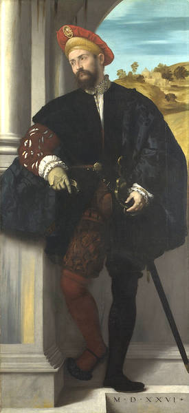
Vasari does however mention Moroni’s master, Moretto da Brescia. He was “a delicate colourist and of great diligence,” we are told, “fond of imitating cloths of gold and silver, velvet, damask and other kinds.” The exhibition opens with a selection of his works: some portraits and an altarpiece. His portrait of the haughty young Count Martinengo (from the Museo Lechi in Montechari) shows the technique that his pupil Moroni would adopt with such success: a three-quarters tilt to the head, eyes fixing the viewer, the sitter’s face the focus of the artist’s efforts, background elements at a minimum (though you will start to recognise some studio props: the gloves, the chair, the leather-bound book). The best portraits are not showpieces of wealth and consequence. They are likenesses—psychological studies—of ordinary human beings. That, to our modern eye at least, is what is most absorbing.

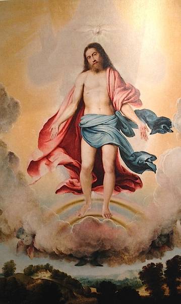
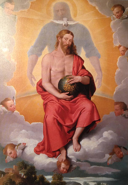
And indeed, they keep the viewer riveted. The show was crowded when I went, and visitors were stuck fast in front of the portraits, audioguides clamped to their heads, whispering to each other in rapt admiration. The altarpieces commanded far less attention. This is not necessarily fair, because if Moroni’s sacred subjects fail, they fail for a reason. The Council of Trent, which abjured the Protestant Reformation, called for a return to the precepts of the past, an establishment of rules and method, a forsaking of invention and novel interpretation. Later it was to shake itself free and find its own Counter-Reformation style, the sensual, ecstatic, exuberant Baroque, charged with a direct emotional appeal. But this had not happened yet. Painters of religious subjects in Moroni’s day were rigidly stuck with old themes and old poses, not wanting to be archaic but unsure how to be modern. This predicament is brilliantly illustrated by two large-scale altarpieces of the Trinity, the first by Lorenzo Lotto (1519/21; Museo Bernareggi, Bergamo) and the other by Moroni (c. 1552; church of S. Giuliano, Albino). Both show pale clouds parting to reveal the primrose-yellow dazzle of Heaven. Christ appears in the centre, upon a rainbow, with the dove of the Holy Spirit above his head. Behind him, in looming shadow, is God the Father. But in Lotto’s version God appears in shadow only, as a suggestion of immanent power, hands upraised. In Moroni’s Trinity, God has been humanized. He has a face, a blue robe. His arms encircle Christ in a gesture of protection. But the overall effect is stilted, bizarre. The rolled up sleeves make him look like a strongman about to perform a feat of heavy lifting. “Is that supposed to be God?” someone asked incredulously, “You don’t normally see pictures of God, do you?” “Of course you do,” his wife testily reproved him, “Michelangelo did one.” Yes, Michelangelo did, in sophisticated, neo-pagan Rome on the Sistine ceiling. A God looking like an ancient Zeus touching fingers with Adam in the guise of a body-perfect ephebe. But that was Rome and that was then. This is Lombardy. One cannot do portraits of God.

Lorenzo Lotto: Trinity
Giovanni Battista Moroni: Trinity

Portraits of men and women, on the other hand, are another matter. Nowhere is this dichotomy better revealed than in Moroni’s sensational Last Supper (1566–9), painted for the Confraternity of the Holy Sacrament in Romano di Lombardia, where the faces of Christ and his disciples are stock character heads, in sharp contrast to the man standing at the back. An intruder into the scene, he plays the role of host or servitor at the supper party, holding a flagon of wine in his hand and looking us straight in the eye. This is a portrait of a real person; perhaps, it is thought, the parish priest of the little town. The dimension he inhabits is perceptibly different from that of the staged actors in the famous dinner drama, who are all playing prescribed parts and have no existence beyond them.

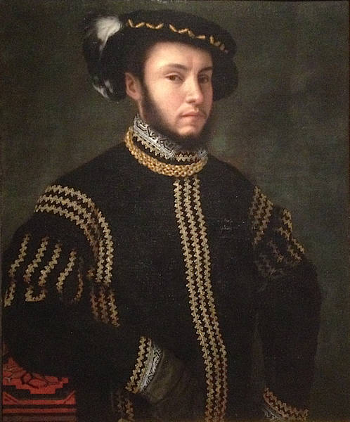
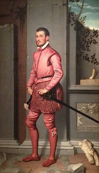
Moroni, like his master before him, was fond of painting fabrics. What Vasari does not tell us is that Moretto painted the first ever Italian full-length portrait, in 1526 (London’s National Gallery has it). His pupil borrowed both the full-length and the three-quarter-length style and took them to new heights. There are some superb portraits in this exhibition, shown to dazzling effect in the third room, where nine works have carefully been chosen to complement each other to perfection. Two seated ladies (opposite each other), three full-length men (opposite each other and opposite the door) and four three-quarter-length men are hung with careful attention paid to which direction their gazes face. Yet the hang is both complementary and antagonistic. The two women, both poetesses, were from opposing factions in the Bergamo of the day, the bloodily feuding Albani and Brembati families. The Brembati belonged to the imperial, pro-Spanish faction: the striking Man in Pink, Gian Gerolamo Grumelli (from Palazzo Moroni in Bergamo, the home of the artist’s descendants), was the husband of Isotta Brembati (the second of the poetesses). It is signed and dated “Jo. Bap. Moronus p. MDLX” and features a Spanish motto: “Mas el çaguero que el primero” (Better to hang back than to rush to the front; an admonition to prudence?). Behind the sitter is a ruined wall. Damaged masonry over which ivy creeps and into which weeds intrude—and beyond which blue sky and cirrus clouds can be seen—is a favourite Moroni backdrop. It occurs in five of the nine portraits in this room and again in the final room. The architectural background with blue sky behind was used by Moretto in his first full-length. Again, Moroni adopts, adapts and carries forward: the warning of ruin and decay, it seems, was his idea.

Moretto: Portrait of a Man (1526)
Moroni: Man in Pink (1560)

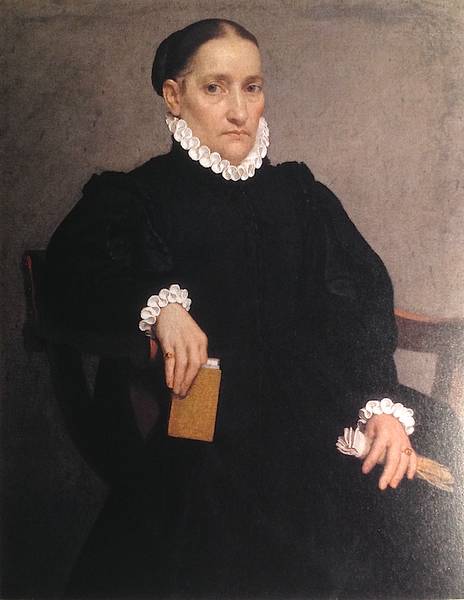
In the final room we come face to face with Moroni’s famous Tailor (c. 1570; National Gallery, London), and other mature works which show, in the curators’ judgement, his role as a foreshadower of Manet and Ingres. The Tailor shows a finely-dressed young man in fashionable slashed pantaloons, looking up from his worktable where he was about to cut a length of black cloth. Black, the exhibition catalogue notes, became the favoured colour for men’s costumes, replacing the sumptuously coloured stuffs of earlier years. The tailor himself is obviously a successful artisan. Tailors, according to the wall caption, often dressed well—perhaps as a way of making themselves walking advertisements for their trade. But it was not the tailor’s eyes that stayed with me, as I walked out onto a rain-washed Piccadilly. It was those of the Lady in Black, whose portrait (c. 1570; Palazzo Moroni, Bergamo) is a model of minimalism and a seeming effortless skill at capturing not just a likeness but a personality.

Go and see this show if you can. The ticket price is not cheap (£12) but I think you will feel it was worth it.

Moroni: Lady in Black

Reviewed by Annabel Barber. The Royal Academy, its history, role and exhibitions, as well as the architecture of its home, Burlington House, are all described in detail in Blue Guide London.

Artwork of the Month: November. Reason, Unreason and the Turin Shroud

“Throw reason to the dogs! It stinks of corruption.” While browsing the Guardian website the other day, I came upon this injunction in an article by Jason Burke, who had seen it scrawled on a wall in Kabul in the 1990s. It was only a matter of minutes after reading it that I checked my inbox and found an email from the historian Charles Freeman, alerting me to his article about the Turin Shroud in this month’s History Today.

© Danielos Georgoudis

Reason. The goddess who arrived with the Enlightenment, with the Reformation. We in the West, self-appointed guardians of the world’s morality, like to believe that we are governed by Reason. But do we fool ourselves? Scientists who question climate change are liable to a similar reception as that with which the Inquisition favoured Galileo. We have our shibboleths and we don’t want to rock them any more than those early 17th-century ecclesiarchs did. Humankind is still guilty at times of being interested not in ideas but in ideology.

Charles Freeman is not one of those. He is firmly on the side of Reason. His fascinating article argues, persuasively, that the Turin Shroud is not the original winding-sheet of Christ but a medieval epitaphios. That is not to make it a forgery. It’s a genuine article, a cloth woven in the 14th century for use in the kind of mystery plays that took place around the Easter Sepulchre. Trawling English country churches as an earnest teenager, Pevsner in hand, I often found myself alerted to the presence of “a fine Easter Sepulchre”. When I found it, I always saw the same thing: a sort of arcosolium, an arched recess with a ledge in it, high enough to sit on. Sometimes the arch was traceried, sometimes plain. But that was all. I always wondered what the Easter Sepulchre’s purpose was. In Freeman’s article we find out. He describes the tradition of the Quem quaeritis (“Whom do you seek?”) Easter mystery plays that re-enacted the events around the Empty Tomb. For these a cloth was required, the winding sheet left behind by Christ on his Resurrection. The Shroud of Turin was one such.

Its claim to be a much older, expressly sacred, relic came in the mid-15th century, says Freeman, when the Dukes of Savoy sought ways to bolster their legitimacy and influence. This seems quite possible. “Relics” were often miraculously discovered by priests or statesmen seeking to revive a flagging popularity or power. The Holy Blood at Mantua is one example. The Chains of St Peter in Rome another. And any number of Holy Thorns in reliquaries scattered across Christendom.

Yet people still stubbornly persist in venerating the Turin Shroud. Why? Are they so impervious to reason and logical argument? I think not. I think it is more a case of people not needing to be troubled by the sordid and disappointing truth. Reason is, after all, by its very nature a source of disillusion. It robs everything of suggestion and fantasy. Much as a small child really doesn’t need to be told by a cocky older sibling that Father Christmas doesn’t exist. In his heart of hearts he knows that. He just doesn’t want to go there.

Freeman’s article has made it much more likely that I will make the journey to Turin in 2015, when the Shroud is once again put on public display. Interestingly—and Freeman is at pains to point this out—the Church itself takes an ambivalent stance. It does not claim that the Shroud is the genuine cloth of Christ. In fact it was the Church that commissioned the carbon dating in 1988, which placed the Shroud somewhere in the 14th century. Yet even if it did originate in a medieval prop-box, centuries of veneration have conferred sanctity upon it. It is valuable as an artefact that reminds us, against all the promptings of reason, that we mortals might—just might—be destined to rise from the grave.

Charles Freeman, history consultant to the Blue Guides, is the author of Holy Bones, Holy Dust: How Relics Shaped the History of Medieval Europe, reviewed here.

Artwork of the month: September. Watercolour of the Great War

The town of Gorizia stands on the Slovenian border in an expansion of the Isonzo valley, hemmed in by hills. It is a peaceful little town with public gardens and buildings in the Austrian style. After the fall of the independent counts of Gorizia in the 15th century, the city remained an Austrian possession almost continuously from 1509 to 1915 and its atmosphere is entirely Central European, despite the street names recalling heroes of the Risorgimento and Italy’s victories against Austria: Garibaldi, Mazzini, Diaz, Cadorna. In the First World War it was the objective of violent Italian attacks in the Isonzo valley and was eventually captured on 9th August 1916. Lost again in the autumn of 1917, it was finally taken in November 1918. The Treaty of Paris (1947) brought the Yugoslav frontier into the streets of the town, cutting off its eastern suburbs, but in 1952, and again in 1978–9, more reasonable readjustments were made, including a 16km-wide zone in which local inhabitants may move freely.

The attractive, wide Corso Italia, lined with trees and some Art Nouveau villas, leads up into the centre of the town. The Palazzo Comunale was built by Nicolò Pacassi, court architect to Maria Theresa, in 1740; it has a public garden. The cathedral is a restored 14th-century building which contains a high altarpiece by Giuseppe Tominz (born in Gorizia in 1790).

Approached on foot by steps up through the walls and past a garden is the peaceful Borgo Castello, built by the Venetians in 1509. Here you will find the Museo della Grande Guerra, one of the most important museums in Italy dedicated to the First World War. Excellently displayed in ten rooms, it has the reconstruction of a trench, and the material illustrates both the Italian and Austrian fronts in the Carso campaign: what makes the displays all the more poignant is the fact that this part of Europe, which today belongs to Italy, was in 1914–18 fighting bitterly for the doomed Austro-Hungarian empire of Franz Joseph, of which it formed a part. A poster of the whiskered emperor adorns the wall of a mocked-up conning tower, exhorting his troops to bravery in action. Enamel badges in the display cases proclaim defeat and humiliation to the English, the Serbs and the perfidious Italians. The watercolour which appears at the top of this piece was painted by Paolo Caccia Dominioni, a lieutenant in the Italian army, who saw action at Castagnevizza and whose brother Cino was killed in a later battle.

Austro-Hungarian soldier, somewhere on the present-day Italian-Slovenian border.

The above text includes an extract from the Blue Guide e-chapter to Friuli-Venezia Giulia. © Blue Guides. All rights reserved.

Rissëu

Rissëu is the local name given in Liguria to a peculiarly Genoese form of decorative cobblestone paving. The style was enormously fashionable in the 17th and 18th centuries; it is thought that it may have been inspired by Graeco-Roman mosaics which the maritime republic’s sailors encountered on their Mediterranean voyages. Or the tradition may be younger than this: there is an apparent kinship between Ligurian rissëu and the patterned pebble-stone paving of the Greek Dodecanese.

Photo by James Howells. ©Blue Guides.

One feature that the pebbles share is their rounded form. Each of them has been smoothed by the sea, which makes them easy to walk on. The bonding medium is lime mortar and porcelain powder. The stones are chosen for their size and colour: usually black and white, though occasionally red. The word rissëu is in fact Genoese dialect for ‘pebble’ and may derive from the French ruisseau, a stream or brook. Beautiful rissëu pavements can be seen throughout Liguria. The example pictured is a detail of the courtyard of Villa Durazzo, in Santa Margherita Ligure.

Other evidence seems to show that the custom is older still: neither Roman, nor Greek nor Hellenistic but Assyrian (roughly 800–600 BC). The pebbles are still water-smoothed, but not by the sea: these are river pebbles. There are at least two sites in Turkey with pavements of this sort. One is Tille on the Euphrates and the other is Ziyaret Tepe. Vast dam-building projects in Turkey mean that both floors will soon be under water (in fact, Tille already is). But there will be a reconstructed pavement in the new Diyarbakır museum (if and when it opens) and visitors will be able to walk on it.

©Blue Guides: Paul Blanchard, Annabel Barber, Paola Pugsley. For more on Liguria, the Dodecanese and eastern Turkey, visit our digital titles list here; to read about the new museum at Diyarbakır (and two other projected new Turkish museums), see here.

Artwork of the month: June, Pordenone’s Noli me Tangere

“NOLI ME TANGERE”

The painter Giovanni Antonio de’ Sacchis (1484–1539) is always known as Il Pordenone, after his birthplace in Friuli, in northeast Italy. According to Vasari, Pordenone taught himself to paint. Certainly his early works are fairly unsophisticated. As he matured, he learned to paint in the Venetian style, with all that that implies in terms of colour and dreamy romanticism. His manner shows a particular closeness to that of Giorgione and Titian. This Noli me Tangere, which hangs in the cathedral museum of Cividale del Friuli, is a good example. It was painted in 1524. Christ appears in a Venetian-pink tunic. Behind Mary Magdalene’s flowing hair we see the angel at the empty tomb. Behind are the alpine peaks that Venetian painters so often included as backdrops in their altarpieces. Christ gestures skywards. We are to imagine him uttering the words put into his mouth by St John: “Touch me not; for I amnot yet ascended to my Father: but go to my brethren, and say unto them, I ascend unto my Father, and your Father; and to my God, and your God” (John 20:17).

When Pordenone left northern Italy in the late 1520s, he fell under the spell of Michelangelo, and his style altered forever, becoming much less spatial, much more sculptural, with highly mannered gesture and with an unsettling, barely suppressed violence. His writhing figures seem to invade the viewer’s space and intimidate him/her. There is something almost Gothic in his dwelling on the more tortured and gruesome aspects of martyrdom. All in all, Pordenone is a fascinating hybrid of Gothic and German elements forced through the Michelangelo mangle.

Important examples of his frescoes and paintings can still be seen in his native town, a pleasant provincial capital with a lively atmosphere and lots of places to eat. Some of Pordenone’s modern buildings are by the Brutalist architect Gino Valle (1923–2003), born in nearby Udine, who worked for many years for Zanussi, producing office and factory buildings for them as well as designs for a number of domestic appliances (including their first washing machine). The Zanussi company was founded in Pordenone in 1916 by the son of a local blacksmith. (It was taken over by Electrolux in the 1980s.)

Pordenone, Udine and Cividale are covered in Blue Guides’ e-guide to Friuli-Venezia Giulia.